There’s a familiar picture of the AI future: we ask for something, the technology quietly takes care of it, and the interface fades away.
For some tasks, that sounds ideal. Nobody wants to navigate five screens to complete a simple action. But when the work involves finances, a customer relationship or a decision with real consequences, making everything invisible creates another problem.
- How do I know what’s happening?
- What has changed?
- What still needs me?
- …and how do I step in if the system has misunderstood?
These aren’t questions that a more capable model automatically resolves. They are experience design questions.
Think about a car that can drive itself. We may no longer need to make every turn, but we still need to know where it is taking us, whether the journey is going to plan and how to change the destination. Removing the driving does not remove our need for orientation.
The same applies here. As more work happens out of sight, the visible experience has to make the important parts easier to grasp. Design becomes less about exposing every function and more about helping someone form an accurate picture of what is happening.
As AI takes on more of the execution, the interface becomes the place where people understand, direct and trust that work. The opportunity isn’t simply to put a chat box on existing software. It’s to rethink what people should have to do themselves, what the system can prepare for them, and how the two work together.
Less manual work should also mean less mental work.
From doing every step to directing the work
Imagine asking an AI assistant to help you prepare for a project review.
The relevant information is spread across a few documents, a long conversation and the notes from last week’s meeting. You want to know what has changed, where the unresolved decisions are and what the team needs to discuss. The assistant starts working, and you move on to something else.
When you return, there are fifteen new messages.
Some describe documents being checked. Others repeat findings as more information becomes available. Somewhere in the conversation is a useful summary, but you still need to work out which version is current, whether anything is missing and what you should do next.
The assistant may have completed a lot of work. You are still carrying the responsibility for making sense of it.
Today, a lot of effort goes into moving work forward: finding information, checking what is missing, switching systems, chasing updates and remembering what to do next. Much of it sits between the obvious steps. We remember who is waiting for an answer, notice that a new message changes the plan and translate information from one tool into a form that makes sense in another.
AI creates an opportunity to take on more of that preparation and coordination. But if people then have to supervise a stream of messages, interpret technical activity and repeatedly explain the same context, we’ve moved the effort rather than removed it.
There is a difference between reducing the number of clicks and reducing the burden of the work. A screen can have very few controls and still ask someone to remember a conversation, find a missing document and decide which system has the latest answer. Simplicity is not just what we remove from view. It is what we stop asking people to hold in their heads.
In the project review, a better experience would help you arrive ready to make decisions. It might bring together what changed, show the unresolved questions and identify a missing update that needs checking. The supporting material would be available without becoming required reading.
Nor does directing the work mean stepping away from it. You may want to explore an idea alongside AI, correct an assumption partway through or work out what you actually want. The experience needs to support that back-and-forth, not turn every interaction into a final sign-off.
A blank text box is not enough

Conversation is a useful way to express intent. It is less useful when the person has to invent the workflow, know what the system can do and decide how the answer should be presented.
“Ask me anything” sounds generous. It can also place a surprising amount of work on the user, leaving them staring at a blank box, trying to imagine which parts of their day the system could help with.
Imagination asymmetry is a useful lens here. Someone familiar with a system’s possibilities may see a dozen ways to use it. Someone encountering it for the first time may see a place to ask a question. The gap is between what could be useful and what a person can readily picture doing.
Even where a capability exists, its value stays hidden if people can’t recognise a use for it.
Design can help close that gap.
An upcoming meeting could offer “Prepare a review of what changed”. A half-finished travel plan could offer “Compare the remaining options”. Each gives someone a concrete starting point tied to something they already care about. “Explore what AI can do” leaves the person to work out both the job and its purpose.
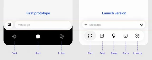
Muse is a good example of this. Alex Cornell fought to keep a tab bar in what could easily have been a single chat screen, because agents are capable of more than people realise. Its Ideas tab suggests ways Muse can help, starting general and becoming more personal as it gets to know you.
The suggestion should also make the scope understandable. Preparing for a meeting might include reviewing selected notes and drafting an agenda. It should not leave someone wondering whether invitations will be sent or documents shared.
Chat remains available, but it isn’t the only way in.
We should also avoid replacing a menu of software tools with a menu of agents. Someone trying to prepare for a meeting should not need to know which specialist agent handles documents and which one handles meeting notes. The visible starting point should be the job they want to do, not our internal organisation of capabilities.
Use conversation to move the work forward. Use the right surface to make the work understandable.
Make the work visible, without making it noisy
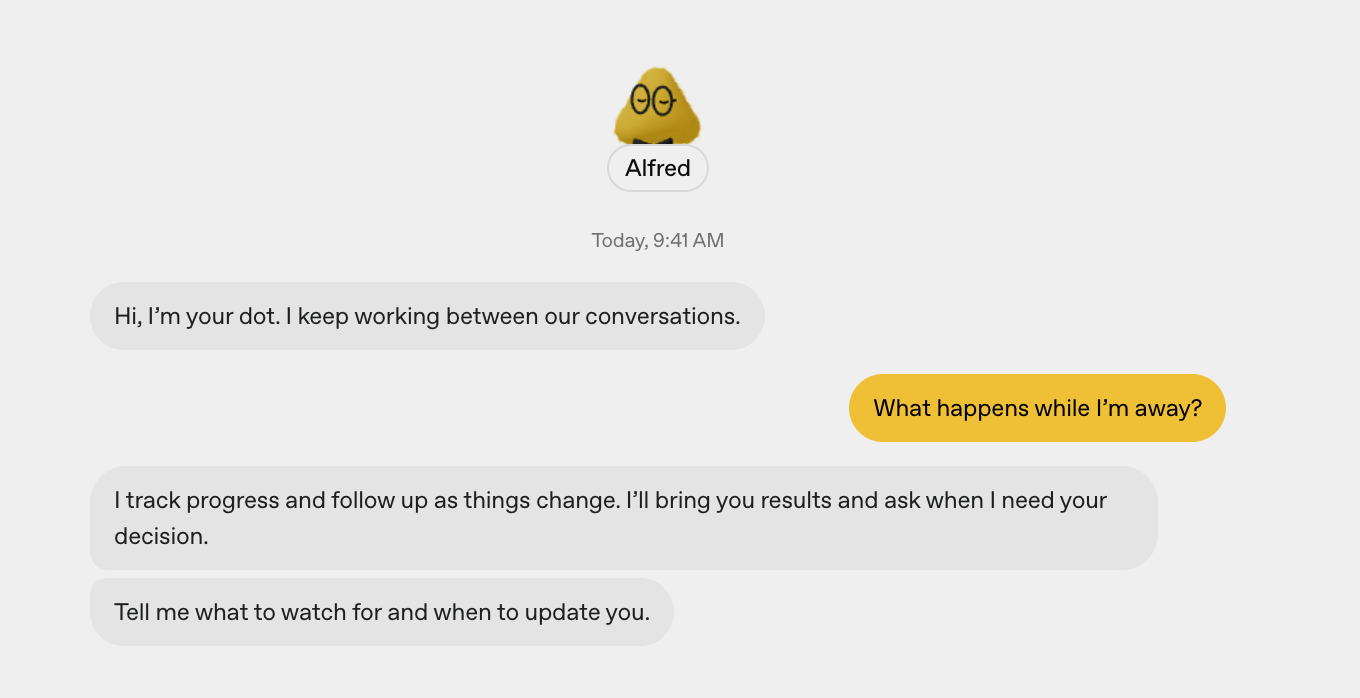
Return to the project review. This time, the assistant acknowledges the request, makes its scope clear and gives the preparation a recognisable place to live. You can see that it is underway and leave.
Once an agent can continue working while someone is elsewhere, the experience stops being a simple exchange of question and answer. People need to be able to leave, return and pick up the thread.
That doesn’t mean showing every action in the main conversation. It means making the important distinctions clear: the request has been received, work is underway, something is blocked or the result is ready.
A short activity indicator can be enough while work is progressing. Someone who needs more detail should be able to see the steps and supporting evidence. The deeper detail should help them inspect the work, not become a requirement for understanding it.
Meta’s Muse shows this in practice. Its status pill was the very first piece of UI designed, built to answer one question: what is my agent doing right now? As Alex Cornell, who leads its design, explained on How I AI, the top level simply says it’s working. Tap once to see what it’s working on, and keep going to reach every step, right down to the raw code. It’s there for anyone who needs to audit it, and never in the way of anyone who doesn’t.
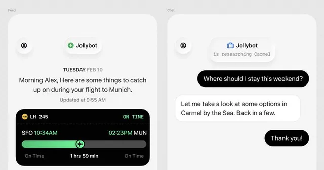
When you return, the first thing you see could be a short account of the outcome: two decisions need discussion, one update is missing and a draft agenda is ready. You can inspect the evidence or the work performed if you need to, without reading a running commentary first.
There is also a difference between work being visible and work demanding attention. Something can be available to inspect without generating a notification. An update deserves an interruption when it changes what someone needs to do, not simply because the system has completed another step.
A truthful status matters more than a lively one. If the system is waiting for a document or needs an answer, say that. A permanent “working” animation may look reassuring, but it leaves people unable to tell whether progress is actually being made. Clear timestamps and grouped updates help distinguish new information from something already seen.
The same distinction matters in everyday tasks. If an assistant is comparing options for a weekend away, each search result does not need your attention. A newly discovered constraint that affects your dates might.
Useful initiative leaves people with fewer things to monitor. Otherwise, the assistant becomes another inbox.
Visibility should reduce uncertainty, not create another feed to manage.
Trust means knowing what is yours to decide
An agent that asks permission for everything is tiring. An agent that acts beyond what someone expected is difficult to trust.
The design challenge is to make the boundary understandable.
Suppose the project preparation reveals that a colleague’s update is missing. The assistant drafts a message asking for it.
Consider the difference between “I’ve prepared a message” and “I’ve sent a message”. They may look like a small wording change, but they represent very different levels of authority. The interface should make that distinction clear before the action, not leave people to discover it afterwards.
As people choose to delegate more, the scope should remain understandable and changeable. Permission to help with one task should not quietly become permission to act across everything. Familiarity can make an experience feel comfortable; it should not be mistaken for agreement.
People should be able to tell whether AI is suggesting something, preparing it for review or carrying out an authorised action. Where their decision is needed, show what will happen and the information they need to judge it. Don’t make them reconstruct the consequences from a long conversation.
Trust also depends on knowing where an answer came from and who is accountable for the next step. That may mean showing a source, flagging information that needs checking, or distinguishing an AI-prepared draft from something a person has reviewed and approved.
And trust is shaped most by what happens when the system gets something wrong.
Perhaps the assistant has used an old delivery date. You correct it. The experience should show which parts of the preparation are affected and whether they have been updated. Otherwise, you are left wondering whether the old assumption survives in the agenda, the summary or a message waiting to be sent.
A useful recovery explains what is complete, what remains uncertain and how to move forward. Sometimes that means trying again. Sometimes it means taking over manually or bringing in a person. These are part of the core experience, not edge cases to hide behind a generic error message.
Give people meaningful control, not a constant stream of confirmations.
One coherent experience, not one interface for everything
People don’t work in a single screen. They move between conversations, documents, appointments and the tools they already use.
The experience should carry the relevant work forward without making people start again.
You might start with a quick request on your phone, review the prepared document at your desk and discuss it with a colleague later. The work needs a clear subject and destination throughout. Opening a different project should not silently redirect the task already underway.
This is where a persistent assistant becomes more than a series of disconnected chats. It gives people a recognisable place to return to, with continuity around their goals and unfinished work. That familiarity can come from identity, language and behaviour, not only from an avatar.
But one recognisable assistant does not require one endless conversation. A focused discussion about a project, a document or a particular decision can have its own context while remaining connected to the broader work. People need to know what they are talking about now, not search through a single timeline to reconstruct every separate task.
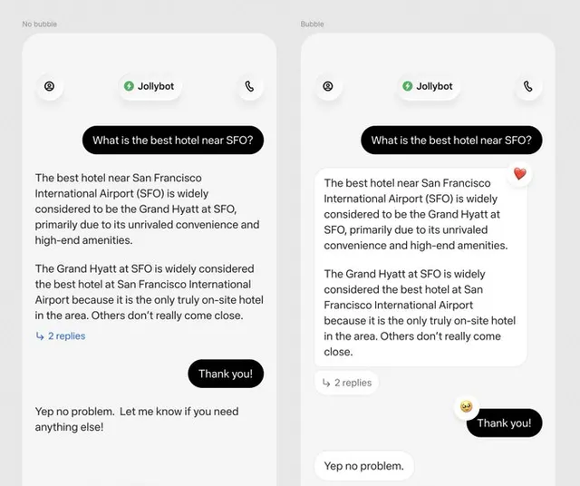
Muse takes this approach. Every message sits in a bubble, because it should feel like an entity, not a tool, and there’s one main chat you could use for everything, with side chats for focused work. As Alex put it, you don’t start a new thread every time you talk to someone you know.
Now imagine the purpose of the project review changes. The team no longer needs to make a final decision. It needs to explore alternatives.
The agenda may need revising. Some questions may no longer be relevant. The earlier preparation should remain available, but it should not continue to appear current without qualification. The meeting itself should not be cancelled simply because its purpose changed. Remembering new information and deciding what authority it grants are separate responsibilities.
That is where continuity becomes valuable: not just when everything goes to plan, but when the plan changes.
Continuity also needs boundaries. A private working note should not become part of a shared meeting summary merely because both relate to the same project. Relevant context should travel with the work; access should remain deliberate.
And when someone returns months later, remembered information needs to be open to correction. A previous preference is useful context, not a permanent account of what they want.
Adapt the help, not the ground beneath people’s feet
The prepared work will not always belong in a message.
A comparison may be easier to understand side by side. A schedule may need a calendar. A process may benefit from a diagram. Voice might suit a quick request while someone is on the move, with a visual summary available when they are ready to review it. The project review might begin with a short conversational summary, then open into an editable brief with decisions, evidence and a draft agenda.
Choosing the appropriate form is part of doing the job well. Asking people to extract a usable document from a long answer leaves more work for them.
That doesn’t mean the whole interface should continually rearrange itself.
People still need familiar navigation, predictable controls and a clear sense of where they are. The opportunity is to combine a stable structure with contextual help and flexible ways of presenting the work.
For design, this means thinking beyond individual screens. We need shared patterns for how work starts, how progress appears, how people review and steer it, and where the result lives. The useful adaptation is in the presentation and available actions, not in inventing a new navigation model each time.
Alex Cornell made a similar point about his own work: with systems that aren’t deterministic, the craft shifts from perfecting every screen to designing the system and scaffolding underneath.
The result also needs a life beyond the conversation that created it. People may need to return to it, correct it, share it with an authorised colleague or understand whether it has become out of date. A beautifully generated answer that disappears into chat history is not enough.
Personality and visual delight can make the experience feel more approachable. They should support comprehension and usefulness, not substitute for them.
Make the experience responsive to context without making people relearn it.
What this means for design
The aim is not to expose every capability. It is to make the core path obvious and bring complexity into view when it becomes relevant.
Five questions can help us judge whether an AI experience is actually making things easier:
- Is it clear how to move forward? People can see a useful starting point and the next meaningful action without having to invent a prompt.
- Can people leave and return easily? Progress, outcomes and anything requiring attention are understandable without replaying the whole history.
- Do people understand what they control? Suggestions, prepared work, approvals and completed actions are visibly different.
- Does the work continue across surfaces? Relevant context and outcomes carry forward without unnecessary repetition or inappropriate disclosure.
- Does the experience feel familiar as it adapts? Contextual help and richer outputs sit within predictable navigation and interaction patterns.
We can use these questions to review complete moments, not just individual screens. Start with someone expressing a goal, follow the work while they are away, then look at what happens when they return, change their mind or need another person to help. A polished starting screen is not enough if the rest of that experience becomes difficult to follow.
The most useful early test is whether someone can explain the situation in their own words: what the system is doing, what it has completed, what still needs their judgement and how to change direction. If they cannot, adding another capability is unlikely to solve the underlying problem.
The test is not how much AI we can put in front of people. It is how much effort we can remove while keeping them informed, capable and in control.
 Further watchingMeta Muse: the AI agent people actually loveAlex Cornell on How I AI